Have you noticed that some of the buses in Vancouver have been sporting some hi-tech gear? I speak, of course, of the electronic ads on the exterior side that play full videoes. I saw one today at 41st and Cambie and it caught me by surprise. The display was bright and was playing a Telus clip. The resolution looked to be about the same as the large electronic signs outside of Casinos and sports stadiums in our area. I wonder if we will be seeing more them?
Speaking of ads, I have been meaning to talk about this ad campaign against homophobia (PAX recap will have to wait):
Essentially the ads aim to get people to rethink their usage of the phrase "That's so gay". Other adds in the campaign uses the jock and generic blonde with some other choice words and stereotypes.
Personally speaking, I don't feel that the ads work that well. Especially with the gamer guy one, the wording is just so confusing that you really don't get the message the first or second time around. Whether this will spark discussion or entice apathy is uncertain. Nonetheless, it's a nice idea and noble cause.
Excuse, I have to go sell a few games so that my life will seem a bit more balanced.
I can't seem to decide if this is brilliant or just plain ol' vanilla bland. Don't get me wrong, I have much respect for DDB, who is a part of the largest advertising/PR conglomerate in the world. I also love vanilla ice cream.
Here's the dilemma, the ads work in drawing in attention, using alternate space, and in selling the product. However, it does nothing really for the branding of the product. While McDonald's already have a strong brand, this campaign does nothing to further it, or even reconfirm it. As such, the ad seems to fall flat. Half the response and comments towards this ad is a simple "I don't get it" or "Is that it?". Because McDonald's has such a strong personality and their brand is instilled into the very core of people's logospace, they expect more from it and from its ads.
I cannot help but think that this campaign would have been better if it was saved for something like, I don't know, a rock concert.
I noticed a few interesting trends with ads recently. Unfortunately I don't have any visual or recorded samples for you so you'll just have to close your eyes and use your imagination.
First up, the new Lotto 649 billboard ads caught my eye recently. In the past, they have always pushed a "Can you imagine?" mindset with their ads, making people think about how nice it would be to win. You could bully people that were mean to you, spend it on frivolous things, or just celebrate like crazy.
The new ads, however, moves away from a "Oh that would be nice" mood to a "I need this!" train of thought. The ad that I noticed had the word "RENT" written in a large water streak with the 649 logo on a yellow sponge wiping it away. Essentially, the image they're trying to portray here is that winning the lottery will take care of all of life's necessary bills, like rent.
It's a smart move made in the wake of the recession. People are penny pinching and may not want to spend those $2-3 on wishful thinking tickets. So, instead, the brilliant advertisers working with the national lotto opted instead for a campaign that makes the lottery look like something necessary to survive.
The other ads that got my attention were a couple of radio ads for Chrysler cars. I believe they were Columbia Chrysler and Maple Ridge Chrysler. Both ads were done using old-school ideas, similar to how the King of Floors work:
The difference was that one ad really worked while the other did not. (The King of Floors mostly work, IMHO). Naturally, with the decline in car sales in general and drastically for all American cars, adverts are necessary to reel in the buying frenzy.
The Columbia Chrysler ads uses the "We're so Crazy!" styled ads, complete with random sound effects to drive home the fact that they're "stark raving mad" and selling cars for low low prices. This ad works. The sound effects and the timing of the ad really makes it stand out from the other ads and connects the message with the consumer in a strong and definite manner.
The Maple Ridge Chrysler ads, on the other hand, fail epically. The announcer is mono-tone and drones on and on. It took immense effort for me to even remember the name of the car dealer. So much, in fact, that I cannot even recall what the selling point of the ad was, except that it had something to do with low prices and you should be excited about it. This ad fails to stand out and fails to make an impact, representing everything you can do wrong with a radio ad.
Budget advertising is something that we can look forward to for at least another year. Hopefully, more people will learn from mistakes of others in the past and do something interesting with that knowledge.
Since I got engaged this month, part of my weekends have been spent with my fiancee shopping for an engagement ring. We finally decided on one with a neat design from Spence Diamonds. It looked something like this:
I like the three stone look and Jasmine likes the hearts in the setting (which you cannot see in the image). We picked a 18K yellow gold ring and rocks that added up to exactly 1.5 carats.
However, insofar, only a small handful of people have been completely turned off from Spence so much that they do not even want to step into one of their stores. Rather, the ads are extremely effective in being retained in people's mind. When they think diamonds, they think of Spence and all the benefits and offers they have. While the ads are dodgey, the stores are utterly brilliant and professional in contrast and, along with the staff and products, are designed to impress.
It really is just a simple practice in being stand-out-unique. If they went with traditional ads, they would just blend in with all other jewellers regardless of how good their offers are. However, the annoying guy's voice just cuts through the white noise and what he says is heard and embedded in your mind.
On top of that, the awfulness of the ads have picked up a viral mode of transportation, spread by word of mouth as people share their mutual dislike of the commercials and positive impressions of the product itself.
It isn't something that can be pulled off easily or consistently. You always run the risk of alienating your customers. Therein lies the ingenuity of the Spence Diamond radio commercials. Not only did they pull it off, but they did it with great and continued success.
You've probably seen these ads or heard them on the radio by now. Dos Equis' fictional spokesperson does indeed seem interesting and intriguing, almost like Sean Connery before he aged into his old and gross phase.
I may have mentioned it before, but the products that require the most advertisements and branding are those that need to differentiate itself from similar products. This is why there are a lot of ads for alcohol, clothing and perfume.
While the ads are quite neat, the branding and target demographic is quite clear with Dos Equis' ads. We can see that the most interesting person in the world is an elderly gentleman, a man of the world even. He is like George Clooney, a bachelor for life who never fails to be seen with a woman on his arm.
Indeed, one must be greyed a bit in order to accumulate the experiences that makes a person the most interesting in the world. This is what Dos Equis is aiming for: men who are perhaps past their prime, but want to believe that they are not out of the game and that their age is an advantage. Even the commercial's film quality reflect this targeting. You will note is a bit grainy and faded, like an old Bond film.
By branding itself has a sophisticated and classy drink, Dos Equis can justify a premium pricing and their customers can buy their way into an excellent first impression.
On the opposite side of the spectrum, here's a Heineken ad:
Nothing too bad at first glance, just people who really love their beer. However, this is starkly contrasted by some print ads and earlier branding attempts by Heineken. While the commercial is targeted at party lovers and frat boys, in the past Heineken has tried to appeal to a more upscale taste.
In fact, around Vancouver I have noticed a few "Carpe P.M." bus ads for Heineken. These ads obviously refers to Carpe Diem, which is latin for "seize the day" meaning the ad is telling you to "seize the afternoon". However, in order to get that, you would need a bit of an education and not just a squealie, excitable persona.
Mis-matching your branding is a bad idea, especially if your catchment is huge. If people are confused about your brand, you lose your entire target demographic since no one can decide if the beer is "them" or not. I'm not saying that all frat boys are uneducated, they are in post-secondary after all, but I am saying that some party goers are not cultured enough to get the bus ads. Which is a pity, because I really like them.
I'm not an artist. I like to be creative but my artistic capacity is a bit underdeveloped. I realize that, with some practice, I may become somewhat decent but, truth be told, I'm fine with the way I am.
When I studied graphic design in university (for two semesters), typography really interested me. It presented a wonderful chance for me to be visually creative without relying on free hand graphics or even regular graphic manipulation.
I studied how to mix san serif and serif fonts together and all the little things that can make a block of text look good while still being legible. I was quite delighted when a program I made for my girlfriend's tutoring student's solo harp performance gain some minor acclaim. It is not often that people comment about spacing, font size choices, and kerning.
Typography, of course, is the arrangement of text on a page. More often than not, the graphic designer has no control over what text is meant to be on the finished work. However, the designer does have the liberty to arrange the text however he/she likes. I don't have any ads or personal sample available, but the internet has something even better: Kinetic Typography.
While normal typography can be used to make something simple and pristine, or cluttered, or hint at images, etc, kinetic typography takes the whole thing up a notch by representing the action and emotion in the words. In a way, it is trying to compensate for anything that is lost in context, connotation or denotation.
Here you can see the words fly, the disorientating shouting and the meek replies. The creator of this Kinetic Typography sample did really well to convey the pacing and gravity of the speech.
This example is a bit simpler, with the words being arranged in a way that is pleasing and artsy. It is more of an example of different layouts than an attempt at expression. Still, the overall effect is beautiful and enjoyable.
Kinetic Typography have been popping up in commercials all the time in some small way or another. However, it is prominently used here, in the F150 ads which consists of voice over, kinetic type, and some live action/CG shots of the truck.
You can see that it is not overly extravagant, but there is still a fair bit of playing around with the text. These ads succeed on several levels, the liveliness of the words on the screen keeps viewers watching and superliminally passes the advertiser's message to the consumer.
Before I graduated from university, I took a few courses in graphic design as an aid for my future in advertising (still looking!). As such, I've began noticing logos, layouts and typography all around me.
Since last year, I've been looking at the FedEx logo. It seems to be designed so that the E and X at the end formed an arrow in the white space, which I thought was extremely clever. So clever, in fact, that it should be subtlely used in ads.
Selling points like "Going places" or "Fast. Really, fast" or even "It'll get there" would work, but you combine this catch phrase with a closeup on the white space arrow before zooming out to reveal that it's FedEx that you're talking about.
For example, you can have the ad follow a parcel or letter on its journey, using a moving arrow along the way. As this visual is running, have a voiceover talk about reliability, speed, or world coverage. After the parcel is received, pan the camera back a bit to the arrow, which is now at an extreme close up and have the selling point go as the camera pulls back to reveal the FedEx logo. FedEx. Express.
Simple ads work fairly well in times when there is a lot of clutter and, usually, there is a lot of clutter. A nice, simple, three color ad with a clear voiceover and selling point would have great branding potential and the relative inexpensiveness of the ad would allow for greater distribution and impact, much like the Bell white and blue ads that popped up a few months ago.
Canucks lost today in a heart breaking game where they looked like they were going to win handily before getting kicked in the nuts five times.
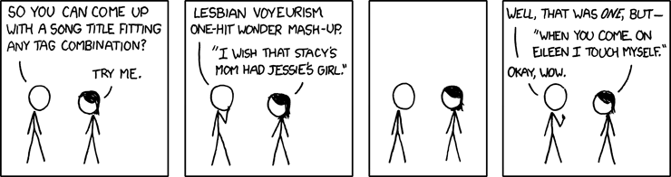
Anyways, one of the webcomics (among many) that I read, xkcd, did a comic the other day and it was a bit weird, since I was just talking about mash-ups.
That's one of the reasons why I'm in a chipper mood that the rest of Vancouver currently. The other is watching SNL with some good friends while playing Bohnanza. But mostly, it's friggin Rickard's White pissing-in-the-cup commercial:
Now, I've mentioned in passing that the bartender looks like he was pissing in the cup more than once in the past. However, after reiterating the fact to a bunch of sleepy, giddy friends, we saw the commercial again and, at 0:06, the dude ordering the drinking totally did a "Hey, why are you unzipping your pants?" look and the bartender simply smiles, revealing that the beverage that everyone in the bar was enjoying was one of his own concoction. It was hilarious.